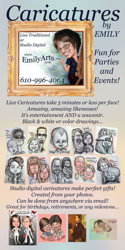
I am pretty satisfied with it for now, down to the 'studio digital' samples, which may not end up in that order. The last one on the right, of my yoga-fanatic son, is still in the preliminary stages---so that's the hold-up...

My focus is on "real people" samples rather than celebrities; I may do a "celebrity caricature" banner next time. For now, I'm using as samples ( find them!) my three children, one of their boyfriends, one of their best friends,Edgar Degas, my fiance, myself, and a bunch of other people I have drawn in my travels!

It's looking a bit formal at the moment Emily. The font really doesn't say caricature for me. It needs something more substantial, but fun, perhaps in a primary colour. Also, it all seems very crammed in (like the writing going down the side of your frame), perhaps there are too many samples, and I think the ones you do have should be framed somehow to separate them from the background (but not necessarily like the frame at the top).
ReplyDeleteThe artwork is great.
Thanks, Paul. that's the kind of constructive criticism I need, never having done a project of this complexity before. I like the 'framimng the samples' idea, perhaps with a very thin gold frame? The font is probably TOO elegant, but I do want one that matches the tone of my work...
ReplyDeleteso I'll be font searching today!
Felicito, que palabras adecuadas..., la idea brillante [url=http://csalamanca.com/tag/comprar-viagra/ ]viagra generico en espana [/url] giolbflllo vwzkdfwozm comprar viagra sin receta en farmacia
ReplyDelete